| < 1. Introduction | 1.2 A Brief History Of Statistical Learning > |
💡 학습 팁: 원문 해석이 어렵다면? 한 줄씩 나란히 번역된 📖 직역본 보기를 추천합니다!
An Overview of Statistical Learning
Statistical learning refers to a vast set of tools for understanding data. These tools can be classified as supervised or unsupervised. Broadly speaking, supervised statistical learning involves building a statistical model for predicting, or estimating, an output based on one or more inputs. Problems of this nature occur in fields as diverse as business, medicine, astrophysics, and public policy. With unsupervised statistical learning, there are inputs but no supervising output; nevertheless we can learn relationships and structure from such data. To provide an illustration of some applications of statistical learning, we briefly discuss three real-world data sets that are considered in this book.
Wage Data
In this application (which we refer to as the Wage data set throughout this book), we examine a number of factors that relate to wages for a group of men from the Atlantic region of the United States. In particular, we wish to understand the association between an employee’s age and education, as well as the calendar year, on his wage. Consider, for example, the left-hand panel of Figure 1.1, which displays wage versus age for each of the individuals in the data set. There is evidence that wage increases with age but then decreases again after approximately age 60. The blue line, which provides an estimate of the average wage for a given age, makes this trend clearer. Given an employee’s age, we can use this curve to predict his wage. However, it is also clear from Figure 1.1 that there is a significant amount of variability associated with this average value, and so age alone is unlikely to provide an accurate prediction of a particular man’s wage.
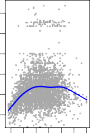
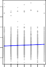
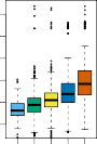
FIGURE 1.1. Wage data, which contains income survey information for men from the central Atlantic region of the United States. Left: wage as a function of age. On average, wage increases with age until about 60 years of age, at which point it begins to decline. Center: wage as a function of year. There is a slow but steady increase of approximately $10,000 in the average wage between 2003 and 2009. Right: Boxplots displaying wage as a function of education, with 1 indicating the lowest level (no high school diploma) and 5 the highest level (an advanced graduate degree). On average, wage increases with the level of education.
We also have information regarding each employee’s education level and the year in which the wage was earned. The center and right-hand panels of Figure 1.1, which display wage as a function of both year and education, indicate that both of these factors are associated with wage. Wages increase by approximately $10,000, in a roughly linear (or straight-line) fashion, between 2003 and 2009, though this rise is very slight relative to the variability in the data. Wages are also typically greater for individuals with higher education levels: men with the lowest education level (1) tend to have substantially lower wages than those with the highest education level (5). Clearly, the most accurate prediction of a given man’s wage will be obtained by combining his age, his education, and the year. In Chapter 3, we discuss linear regression, which can be used to predict wage from this data set. Ideally, we should predict wage in a way that accounts for the non-linear relationship between wage and age. In Chapter 7, we discuss a class of approaches for addressing this problem.
Stock Market Data
The Wage data involves predicting a continuous or quantitative output value. This is often referred to as a regression problem. However, in certain cases we may instead wish to predict a non-numerical value—that is, a categorical or qualitative output. For example, in Chapter 4 we examine a stock market data set that contains the daily movements in the Standard & Poor’s 500 (S&P) stock index over a 5-year period between 2001 and 2005. We refer to this as the Smarket data. The goal is to predict whether the index will increase or decrease on a given day, using the past 5 days’ percentage changes in the index. Here the statistical learning problem does not involve predicting a numerical value. Instead it involves predicting whether a given day’s stock market performance will fall into the Up bucket or the Down bucket. This is known as a classification problem. A model that could accurately predict the direction in which the market will move would be very useful!
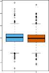
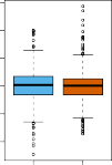
FIGURE 1.2. Left: Boxplots of the previous day’s percentage change in the S&P index for the days for which the market increased or decreased, obtained from the Smarket data. Center and Right: Same as left panel, but the percentage changes for 2 and 3 days previous are shown.
The left-hand panel of Figure 1.2 displays two boxplots of the previous day’s percentage changes in the stock index: one for the 648 days for which the market increased on the subsequent day, and one for the 602 days for which the market decreased. The two plots look almost identical, suggesting that there is no simple strategy for using yesterday’s movement in the S&P to predict today’s returns. The remaining panels, which display boxplots for the percentage changes 2 and 3 days previous to today, similarly indicate little association between past and present returns. Of course, this lack of pattern is to be expected: in the presence of strong correlations between successive days’ returns, one could adopt a simple trading strategy to generate profits from the market. Nevertheless, in Chapter 4, we explore these data using several different statistical learning methods. Interestingly, there are hints of some weak trends in the data that suggest that, at least for this 5-year period, it is possible to correctly predict the direction of movement in the market approximately 60% of the time (Figure 1.3).

FIGURE 1.3. We fit a quadratic discriminant analysis model to the subset of the Smarket data corresponding to the 2001–2004 time period, and predicted the probability of a stock market decrease using the 2005 data. On average, the predicted probability of decrease is higher for the days in which the market does decrease. Based on these results, we are able to correctly predict the direction of movement in the market 60% of the time.
Gene Expression Data
The previous two applications illustrate data sets with both input and output variables. However, another important class of problems involves situations in which we only observe input variables, with no corresponding output. For example, in a marketing setting, we might have demographic information for a number of current or potential customers. We may wish to understand which types of customers are similar to each other by grouping individuals according to their observed characteristics. This is known as a clustering problem. Unlike in the previous examples, here we are not trying to predict an output variable.
We devote Chapter 12 to a discussion of statistical learning methods for problems in which no natural output variable is available. We consider the NCI60 data set, which consists of 6,830 gene expression measurements for each of 64 cancer cell lines. Instead of predicting a particular output variable, we are interested in determining whether there are groups, or clusters, among the cell lines based on their gene expression measurements. This is a difficult question to address, in part because there are thousands of gene expression measurements per cell line, making it hard to visualize the data.
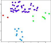
FIGURE 1.4. Left: Representation of the NCI60 gene expression data set in a two-dimensional space, $Z_1$ and $Z_2$. Each point corresponds to one of the 64 cell lines. There appear to be four groups of cell lines, which we have represented using different colors. Right: Same as left panel except that we have represented each of the 14 different types of cancer using a different colored symbol. Cell lines corresponding to the same cancer type tend to be nearby in the two-dimensional space.
The left-hand panel of Figure 1.4 addresses this problem by representing each of the 64 cell lines using just two numbers, $Z_1$ and $Z_2$. These are the first two principal components of the data, which summarize the 6,830 expression measurements for each cell line down to two numbers or dimensions. While it is likely that this dimension reduction has resulted in some loss of information, it is now possible to visually examine the data for evidence of clustering. Deciding on the number of clusters is often a difficult problem. But the left-hand panel of Figure 1.4 suggests at least four groups of cell lines, which we have represented using separate colors.
In this particular data set, it turns out that the cell lines correspond to 14 different types of cancer. (However, this information was not used to create the left-hand panel of Figure 1.4.) The right-hand panel of Figure 1.4 is identical to the left-hand panel, except that the 14 cancer types are shown using distinct colored symbols. There is clear evidence that cell lines with the same cancer type tend to be located near each other in this two-dimensional representation. In addition, even though the cancer information was not used to produce the left-hand panel, the clustering obtained does bear some resemblance to some of the actual cancer types observed in the right-hand panel. This provides some independent verification of the accuracy of our clustering analysis.
Sub-Chapters
| < 1. Introduction | 1.2 A Brief History Of Statistical Learning > |